2024 September Entries
Topic: Open Judge: Art Jacoby
(Double Click on any image below to start slide show)
BASIC LEVEL ENTRIES
-

-
1st – 9 – I think this is lovely wildlife capture. I like the lighting and the colors. My only suggestions are to crop some from the bottom and add some space in front of the subject.
-

-
2nd – 9 – I think this is a very good nature/wildlife capture. I like the colors, the diagonal and the details. For me, toning down the bright spot on the left side, increasing the contrast a bit and adding more space on the top and left would strengthen the composition.
-

-
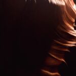
3rd – 8 – I think this is a different take on an often photographed subject with dramatic lighting and a risky crop. For me, there is not enough detail in the shadowed areas. I think that binging out more details in the shadows could make this image soar.
-

-
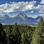
HM – 8 – I like that there is a fore, middle and background in this landscape and there is nice detail. If the subject is the mountains, I would prefer less of the trees in the foreground. Cropping up form the bottom a bit could do this to create a panoramic composition. You might also select the mid and background and add some more contrast. If you took the photo at sunrise or sunset it would probably be more dramatic and interesting. You could do this post processing.
-

-
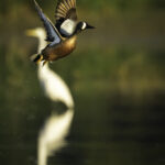
7 – I like the placement in the subject and the soft background. For me, the white egret in the background is distracting. I think that toning it down significantly would improve the image significantly.
-

-
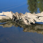
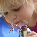
7 – I like the reflection and the interesting subject. For me, the main subject is too bright. Selecting it and darkening it a bit too bring out more detail could work. You might also crop a bit from the bottom.
-

-
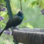
7 -I like the title and the soft background. I find the pole behind the subject distracting. You could remove it or if possible move to the left before taking the photo. You could crop some from the right side and from the bottom and lighten the subject to bring out more details.
-

-
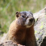
7 – I like the subject and his expression. For me the bright background is distracting. I think you could darken it and crop some from the top and left side.
-

-
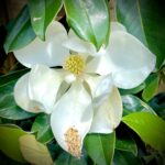
6 – I think this is a nice in focus macro shot with good detail. . I would tone down the green leaves a bit. I like how they frame the subject but they pull my attention away from the lovely and interesting subject. You could tone down the distracting highlights on the green leaves and fill in the burned out highlights on the white petals. I would also remove or darken the yellow leaf on the lower left corner.
-

-
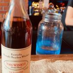
4 – I appreciate that this is a rare subject. For me, this is more of a record shot. I like the off center composition. You could have included the top and bottom of the bottle. You could use a wider aperture to blur the background. I find the blue jar distracting. You could remove or desaturate it. For me, darkening the background, toning down the light areas to the right and taking the photo from a lower perspective might make it stronger. It is a good ideas that when you have a stationary subject to shoot from several perspectives, distances and angles. I hope that you got to sample some. I did when I was in New Zeeland of all places.
ADVANCED LEVEL ENTRIES
-

-
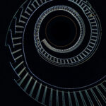
1st – 10 – I think this is well seen and well composed, less is sometimes more. You could try increasing the contrast and brighten the center of the spiral.
-

-
2nd – 10 – I think that you have captured a peak moment with this photojournalistic image. For me, cropping some from the bottom, the top and the left side would make it even stronger.
-

-
3rd – 9- I think this is a clever story telling image with good color and detail. For me, there is too much going on. Cropping from the left to the letter R and from the right to the Z could make it a stronger composition.
-

-
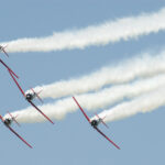
9 – I like the composition, perspective, diagonals, color palliate and the smoke trails. You could try increasing the contrast a bit and adding a slight vignette.
-

-
9 – I think this is good travel photo with my eye traveling from the vehicles in the foreground to those in the middle and then up to the great sunset. For me, a bit more saturation and contrast and cropping a bit from the bottom could give it more impact.
-

-
8 – I think this is a nice animal portrait. I like the red against the soft green background. For me, some of the feathers seem a bit soft or slightly out of focus. You could use a smaller aperture and/or sharpen them with Topaz AI sharpen. You might also brighten his eye a bit and add some space on the left side.
-

-
8 – I think this is well seen. For me, the story is the interaction between the frog and ghost. I don’t think the roof of the car adds anything. You could crop down to the top of the window. I think that if you selected the frog and toned down some of the bright areas and also lightened up the ghost a bit the connection might be stronger.
-

-
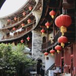
7 – I think this is a nice travel photo. For me, it is an establishing shot. I see the curves and the lanterns as the subjects. Cropping up from the bottom to the man or to the lowest lantern, toning down the white oval, increasing the contrast and saturation a bit would I think make it a stronger image.
MASTER LEVEL ENTRIES
-

-
1st – 10 – I think this if a beautiful environmental portrait with soft tones and good light. For me, the light blue on the left side is distracting. It could be toned down and or darkened.
-

-
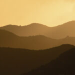
2nd – 10 – I like this well composed landscape with the undulating shapes and different shades of color. I might increase the contrast a bit.
-

-
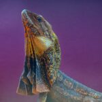
3rd – 9 – I like this portrait of the lizard with the details and colors, the crop and the diagonal. For me, the vibrant saturated background competes with the interesting subject. You could brighten the eye a bit, change the color to be a complimentary one or desaturate it a bit.
-

-
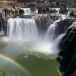
HM – 9 – I think the title fits and the silky water is well done. For me, it is a bit too bright. You could try a curves adjustment to increase the contrast, bring out some more details and it might also increase the impact of the rainbow.
-

-
9 – I think this is a well seen and well composed story telling image. I like how the locks lead may eye through the frame, along the river to the buildings in the background. For me, it is a bit too bright. I think increasing the contrast, especially toning down the light areas and adding a vignette could make more compelling. You could also try cropping some from the top to keep the viewers’ attention on the locks.
-

-
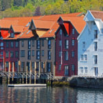
8- I think this is a well seen architectural capture with a good color palliate. For me, the bright white side of the building on the right is distracting. For me, you could tone it down. You could also crop a bit from the top and bottom and increase the contrast.
-

-
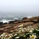
8 – I think that you have captured the feeling of serenity with the fore, middle and background. For me, there is a bit too much plain sky. You could crop some to draw attention to the foreground and middle.
-

-
8 – I like how there are two triangles in the composition and I feel the intensity or their feelings. For me, it is a bit too bright. You could try a curves adjustment to tone down and bring out more details in the overly bright areas. I find the bright yellow shirt in the background distracting
-

-
8 – I think this is a good story telling image with the vertical bright subject against the horizontal lines. For me, it is a bit washed out. I think a slight curves adjustment to increase the contrast a bit and maybe crop some from the top and the left side so my eye is not drawn away to the subject.
-

-
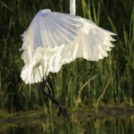
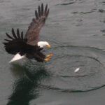
8 – I think this is a good story telling wildlife capture. I like the outspread wings and the circles in the water. For me, it is a bit soft and the whites seem to be a bit burned out and lacking details. . A faster shutter speed and exposure compensation could work. You might be able to bring out some more detail in the shadowed area of the wing. Post processing and/or a fill flash with a Fresnel lens might do that.
-

-
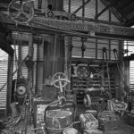
8 – I think this is a good documentary image. For me, it is a bit flat and could use more contrast. It might be even stronger if it was taken from a lower perspective. I recommend taking several shots of a subject like this from many different perspectives and angles.
-

-
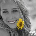
8 – I like the contrast of the bright yellow flower against lovely desaturated subject. For me, since the flower is the main subject you could crop even more tightly and either make the young lady in the background black and white or since you have kept some color increase the saturation a bit.
Copyright © Dandelion by Pexeto
