2026 April Entries
Topic: Around Robson Ranch cell phone only
Judge: Sandy Dimke
(Double Click on any image below to start slide show)
ALL ENTRIES
-
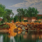
- 9.5 – Welcome to the Ranch BY: Kitz Parker

-
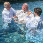
- 9.0 – A Testament of Faith BY: Steve Simpson

-
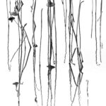
- 9.0 – High Key Stems BY: Frank Barnhart

-
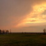
- 8.0 – Stormy Sunset BY: Jerry Schlesinger

-
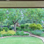
- 7.9 – Robson Garden BY: Nick Alvarado

-
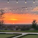
- 7.5 – Golden Hour on the Courts BY: Betty Alvarado

-
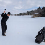
- 7.0 – Committed BY: Michael Patterson

-
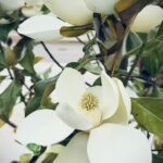
- 7.0 – Sweet Smell of Magnolias BY: Christine Sutton

-
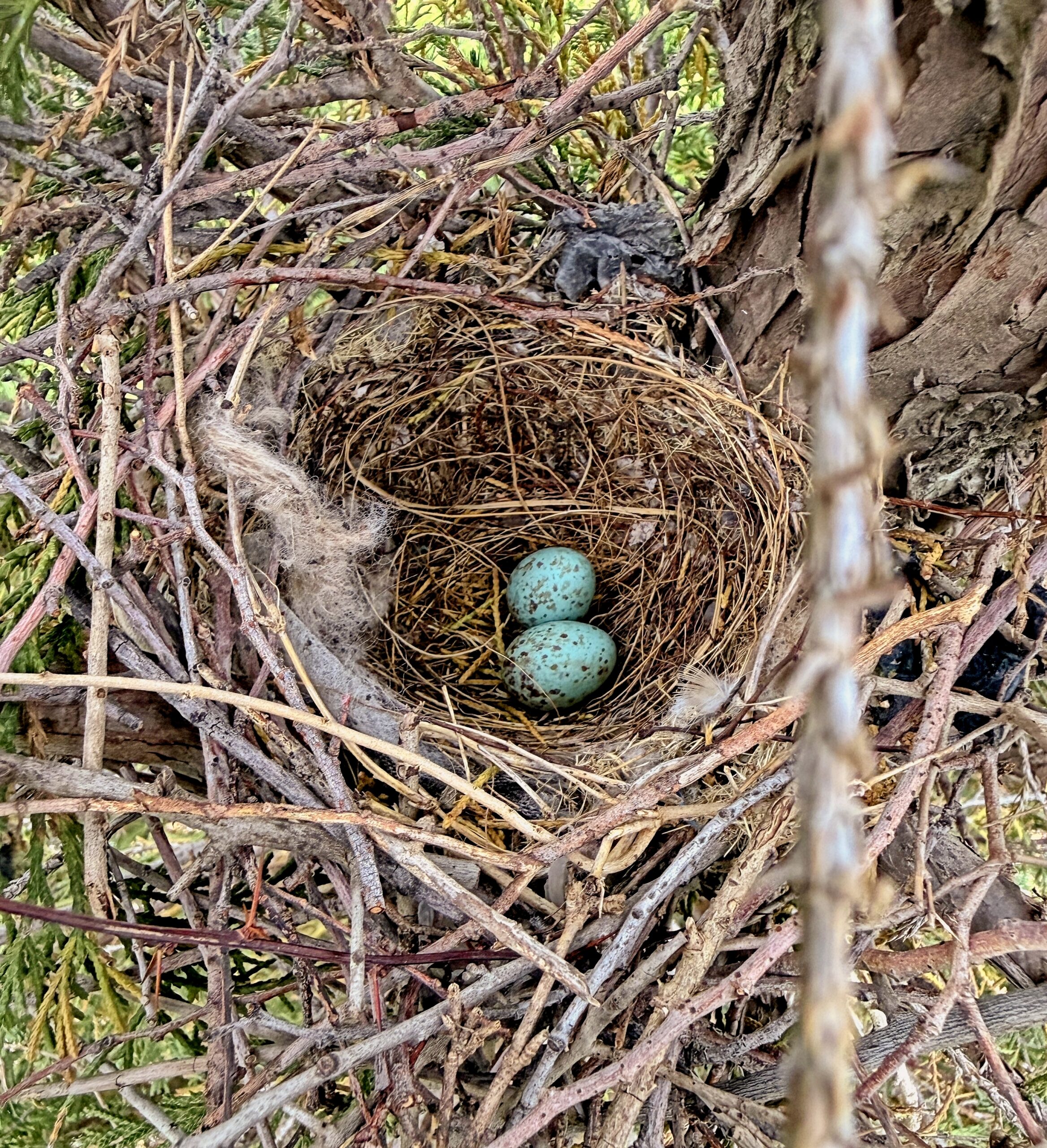
- 6.0 – April Eggs BY: Randy Taylor
-
- 6.0 – Hawk-eye BY: Kimo Sutton

-
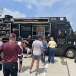
- 5.0 – What?? Main Lobster in Texas!! BY: Barbara Finney

| Title | Score | Comments |
|---|---|---|
| Welcome to the Ranch | 9.5 | Very well done. I have never been to your community but this photo makes me want to go there and even live there. You caught beautiful light, great reflections, and composed it leading the viewer in with more normal trees and the delivering a mini waterfall. No changes . You fulfilled the assignment in a beautiful way, capturing your community in it’s best light. |
| A Testament of Faith | 9.0 | This image had the Wow factor because of the striking contrast of the shite garments and shimmering blue water. The darker band on top also helps to keep the viewers eye into the subject frame. The position of the people, in a semi cicle, offers a leading line into the frame and, again, keeps the viewers eyes inside the image. Composition was well done. You can see all the action and feel like you are there, taking part in it. Only better composition would be if there was a bit of action- the beginning of a submersion of the person being baptized.
Technically, the whites were not blown out so excellent exposure and detail in those whites. Overall a well done image with good composition, technical quality and impact. |
| High Key Stems | 9.0 | The maker took this assignment and made it his/her own. Not easy to create a high key image from a cell phone but this one was successful. Composition is quite busy but the frame is filled with interesting lines and forms and the overall image works. Your eye first wants to establish where the waterline is and what’s real and what’s a reflections . It’s an abstract so that isn’t important but you brain tends to want to make sense out of lines and forms. There’s a few ripples to accomplish this. The choice of submitting this in monochrome was perfect. No distractions that color might create. Nice pure whites and blacks. No tonal range needed. Good job. |
| Stormy Sunset | 8.0 | To be honest, sunset shots rarely do well in general competitions unless there is a really strong foreground of interest to carry it off – a large tree on a beach, a lighthouse, a silhouette but this sunset has enough elements of interest to carry it off. First the composition – the lights of the building are a great lead in line to bring the viewer directly to the sunset clouds. The lack of foreground or middle ground trees then the 2 surprise tress on the right help balance the image. The far right tree even has a bend that brings everything full circle. I usually like the foreground to be very dark or have some detail, not in between, but there’s enough detail in the right side of the foreground, again, to pull this off. Nothing great but together they all work to make a pleasing image. |
| Robson Garden | 7.9 | Framing adds a lot to this general landscape image. There’s a lot going on and the framing helps bring focus to the area of interest. Overall the image appears flat on my screen. I bumped up the contrast 15% and that make the impact more pleasing (at least to my eye). The major downfall in this is the right side framing. The wall used to confine the image is not straight. That is very awkward for the viewer. Please check your perspective before shooting, and if you can’t correct it in the camera, do so in post processing. I also felt the top frame, especially, was very heavy so I reduced the size of the ceiling frame a bit. Garden itself looks great. I like the fencing mixed with greenery and the leading and exiting path lines that the maker chose to incorporate into the image. |
| Golden Hour on the Courts | 7.5 | I love that the maker saw these lights and tried to frame the sunset wit them. Good eye. Nice composition with the sunset occupying the majority of space and the courts used as the leading line. The rooflines are boring with so much brown/tan so bump up the contrast a bit more to give them some definition and impact. All those roofs are pointing up at the sunset and lights, so take advantage of them.
The lights – Great until we get to the top row. This is the most important row since that’s where your eye goes. Unfortunately and top row is not level. Just crop off that row and the curved row beneath is just as great a leading line to bring the viewers eye in and keep it in the frame. Personally I thought the velvet green of the courts (?) were a bit too dark and could use a 10% brightening to make the image more appealing and the color better balanced with the sunset. Nice job overall. |
| Committed | 7.0 | I love the creativity – the concept that the maker was attempting. Show the unusual. Show the unexpected. However. the image is very dreary. The sky is grey and the snow is grey. Little detail in either. It would have been more effective to wait until the sun came out so you have a blue , white puffy cloud sky contracting with the snowy airway. The maker photographed the golfer from a waist high position, which is the least effective way to capture another person’s action. A far better perspective would be for the camera to be down closer to the ball. The ball is so small it has to be searched for in this image. Shoot low and capture the swing as the golfer starts to hit the ball so the ball is more prominent against the snow. The buildings to the right are also out of proposition and appear to be so slanted, they are falling down.
Overall, composition / perspective needs work to be more dramatic, technically giving more tonal separation between the sky and the snow and both would create a more impactful image. |
| Sweet Smell of Magnolias | 7.0 | I appreciate that the maker tried to capture backyard or local flowers in the image but magnolias are a tough subject, especially for a cell phone. One of the problems is getting a composition that is pleasing . This is an example of another image where there’s just too much going on. The rule of thumb for botanical images is always to shoot when the light is even – overcast day, early in the morning so you have that correct and there’s nice smooth light on the white petals. There’s just too much in the frame for the eye to focus. Too much background white coming through to fight with the white petals. My suggestion would be a very close crop to one blossom. Focus on the center of the flower – the most interesting element – and let the view appreciate what goes into creating the beauty of a magnolia. Something more in line with the suggestion cropping where you can see the detail in the center element. |
| April Eggs | 6.0 | I love the spring colors of the robin’s eggs and the fact that the subject was captured from above so you can clearly see the nest and the eggs. Unfortunately the subject gets lost in all the extraneous material surrounding the nest. The image needs to be cropped much closer to give the eggs the impact that they deserve. The white stick on the right is very distracting and can be eliminated by totally cropping that side out of the photo. I now can see the picturesque swirl of one of the nesting strands that circle the eggs, giving the image a complete circle.
Composition if Fine, if cropped closer, technically the nest and the eggs are well exposed and again, for impact, the wonderful color blue against the brown is perfect once the viewers eyes are brought to the important part of the image. |
| Hawk Eye | 6.0 | I give the maker a lot of credit for tying to capture a hawk with a cell phone. You have a good eye and waited till the hawk’s profile gave you a pleasing image. Excellent composition. If you did this well with a cell phone, you should keep shooting birds with your camera, if you don’t already do that. Great job of cropping to the important elements in the frame.
I think the major issue here is that to blow up the image and crop it appropriately, as the maker has done, is pushing the pixels beyond their limits. The image loses details in all the whites and appears blown out. Just too pixelated for comfort. The title “Hawk Eye” is great so go a step further and use the dodge tool and brighten up the eye of the hawk so you can actually see it. One quick fix. The leaves behind the bird are also very bright and take away from the bird itself. Tone those down and the bird will stand apart and have more prominence in the frame. |
| What? Maine Lobster in Texas? | 5.0 | Yes, we even have a Maine “lobsta” truck selling rolls at high prices in South Carolina and people line up.
Ok here you have a food truck. Why do I see only the backs of customers. I want to see their faces, drooling with anticipation. I want to see a lobster roll in someone’s hand or the chef handing one down to a customer. Eating a roll. Something. This tells me you have a community of people’s backs not faces. It does not tell me the story of the truck or lunch time except for long lines. This is a snapshot. Not a photograph. Sorry. No thoughtful composition. Technically the exposure is fine with good details and even nice cloud details. Impact – none that I can see. Shot front from corner sandwich board showing the people waiting in line with wallets outstretched. Something to give me a story. |