2026 July Entries
Topic: OPEN
Judge: Laszlo Podor
(Double Click on any image below to start slide show)
ALL ENTRIES
-
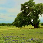
- 5.5 -The-Leaning-Tree BY: Barbara Finney

-

- 5.5 Bob-White-Watching BY: Dick Remski

-

- 5.5 Cardinal-launch BY: Randy Taylor

-
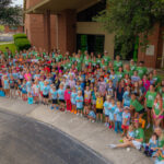
- 5.9 -VBS-Changing-Lives BY: Steve Simpson

-
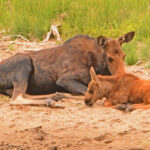
- 5.9 Winkle-Family BY: Ron Ice

-

- 6.5 Weve-Got-This-Blackie BY: Betty Alvarado

-
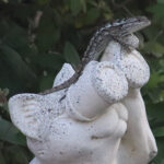
- 6.5 Dual-lookouts BY: Jerry Schlesinger

-
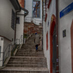
- 7.0 Almost-Home BY: Timothy Battle

-
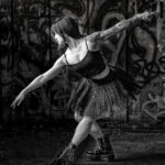
- 7.5 Asphalt-Arabesque BY: Michael Patterson

-
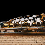
- 7.6 Ready-to-Play BY: Frank Barnhart

-
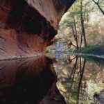
- 8.0 West-Fork-Oak-Creek BY: Linda Wagner

-
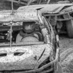
- 8.0 A-day-at-the-races- BY: Nick Alvarado

-

- 8.5 Antalope-Canyon BY: Kitz Parker

-
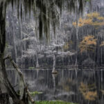
- 9.5 Caddo-Lake-Fall-Landscape BY: Ron Bautsch

JULY JUDGES COMMENTS
- A day at the races
Score: 8.0
Comment: I would say, a hard day at the race – I don’t know how the drivers see where they are going… It is a tight shot of the two cars with the focus on the driver and that plush toy in the car. The mud is everywhere; the tight crop probably tells a stronger story than a wider version of the scene. The B&W conversion was a good choice for this image. Although Mario is looking out of the frame to the left, the composition works well. More sharpness on the person and the plush toy would have resulted in a higher score.
- Almost Home
Score: 7.0
Comment: This reminds me of some of my trips to Germany a few years ago. The lines on her coat are working well with the lines of the steps – she almost becomes invisible in the frame. The edges of the steps are leading us up to that wall in the back – perhaps the destination for the person in the frame.
I think the image would need some more light – maybe about two thirds of a stop more to make the scene more vibrant. I would increase the whites as well to have more contrast. There is a bright section on the left side of the image that might need to be cropped off. The brown area on the right side cannot be cropped off due to the sign above it, but if this image is in an open category, you can possibly clone out that brown area on the right edge. Well seen!
- Antalope Canyon.jpg
Score: 9.5
Comment: This is a commonly photographed place; there are many images of the canyon. The striation looks great; the hues are beautiful in the image. I can see some halos around the edge between the sky and the rock. Have you tried cropping out the sky altogether? It would put more emphasis on the striation and the colors of the layers. Well done.
- Asphalt Arabesque
Score: 7.5
Comment: The tones are beautiful in the image, and her skin tone is well handled. I believe the background was darkened, there is a halo around boots and part of her body. You might want to review the mask. I would imagine a lighter gray area below and behind her, since the light is coming from the left and the ground does not show that. For me, the image is a little too tight on the left and right sides. There is a lighter band along the top edge – you might want to crop that off.
- Bob White Watching
Score: 5.5 - Comment: The bird’s pose is very good; he is alert and locked eyes with the camera. Placing the bird on the right side of the image with that plant on the left created a balanced composition. I can see some large areas of artifacts in the image and fuzziness around the plant stems. The processing on the bird looks like paintbrush swipes, swiping out the details in the feathers. If this is creative choice, it looks OK. I can see some banding in the background in the upper part of the frame.
The bird’s legs are cropped off – it would be better to leave the leg in the frame.
- Caddo Lake Fall Landscape
Score: 9.5
Comment: What a wonderful location. The colors in the image are beautiful. The exposure and processing seem to be done very well. First, I thought that the larger green area on the bottom edge might need to be cropped out, but it does seem to work as it is center anchoring the image. If anything, I would suggest cropping a tiny bit off the left edge to remove the white area that is on the edge there. The same crop could be done on the right, where lighter gray tree trunk and its reflection are right on the edge – this latter is not as significant, but the one of the left side would need to be removed in my opinion. Very well done.
- Cardinal Launch
Score: 5.5
Comment: It is always fun photographing birds. They are fast, making the capture more difficult. The pose of this cardinal works as the angle of the light green plant is almost parallel to the bird. I think the composition is slightly off – leaving more space on the right and less on the left edge would add to the launching action effect. For me, the bottom is too generously cropped and still, the bottom of the curve of the metal is partially cropped off. I would suggest removing half of the area below the bird. The cardinal’s feathers do not seem to have details. I can see artifacts in the image – you might want to check the processing to see which slider caused the problem. If you have another image in the sequence that shows more of the left wing of the bird, that might work somewhat better.
- Dual Lookouts
Score: 6.5
Comment: I thought that the image title was very good and funny. For me, the image seems to be soft and that might be due to the high ISO digital noise. I looked at the settings, and I believe you could have lowered the ISO quite a bit by widening the aperture from f/10 to f/5.6 or something around that, and this would soften the background as well. The shutter speed seems to be too fast for a resting lizard. In my opinion, the composition is not ideal. The image is too tight on the right side, and I think you can crop off from the top.
- Ready to Play
Score: 7.6
Comment: The music theme works well in this image. The instrument is sharp and there is enough sharpness in the notes as well. The arrangement of the instrument is cutting the image into three major areas: the foreground rectangle of the notes, the almost triangular shape of the instrument and the large black triangle in the top. For me, the black area is too large negative space in the frame. It seems to me that you darkened that area in post-processing by creating a mask above the instrument. The three small areas of dark gray on the right edge of the instrument gave it away – those areas were left out from the mask.
- The Leaning Tree.jpg
Score: 5.5
Comment: That tree in the image is a wonderful one – large and lonely. It is just a nice subject for a photograph. The wildflowers in the foreground add to the impact. Maybe with a wider angle that would bring some of the flowers much closer and larger in the frame would also work well. The title says leaning tree, but for me, it seems that the horizon is also leaning – maybe it is a sloping area, but as a viewer, who is not familiar with the place, would not know that. The image seems to look like watercolor painting, with not much detail in the image. I can see strong color fringing around the tree and around the horizon line – this might be a result of some post-processing technique. The foreground mostly shows blue flowers, but I can see one yellow in the bottom right corner, and it is cut in half. You might want to crop that flower out from the frame.
- VBS Changing Lives
Score: 5.9
Comment: You captured a nice group of happy people. I find it difficult to photograph large groups and have all of them in the image with open eyes. I think the angle of the photo is not ideal, as the curve makes the people on the right side much larger than on the left. This angle also creates larger negative space in front of the group. Photographing them straight on might be a better choice for me. It seems to me that there was some image merging done either manually or in a panorama stitching tool, as I can see some heads on the right that are not well aligned. One of them is the lady on the bottom edge and the little boy in her lap and another well-visible is the girl in green t-shirt above the lady with the straw hat (third from the right). Without this problem the image would have received a higher score. When photographing a group of people, we need to make sure that all of them are fully in the frame and not cropped off – the lady in the bottom right is only partially in the frame.
- West Fork Oak Creek
Score: 8.0
Comment: This makes me remember a similar scene on Vancouver Island, where the coastal rock formed like a towering wave. I think the composition is unusual as the horizon level is right in the middle of the frame and the rock formation is vertically dividing the image into two halves that are almost identical in size. But it seems that this works well. The leading lines on the rock and the edges of the water are well composed into the photo. I believe you can add to the impact by opening up the shadows on the rock surface and its reflection – some added clarity there would enhance the beautiful textures on the rock wall. When I first looked at the image, the brightness in the right top quadrant seemed to be too much – have you tried toning it down slightly?
- We’ve Got This, Blackie
Score: 6.5
Comment: This is a touching moment showing the relationship between the boy and Blackie. The lighting conditions were not ideal for the image – the boy is well lit, but the dark areas on the horse do not have much detail. There are a couple of bright spots on the head of the horse – you might want to tone those down. The image seems to be soft for me. The eyes, both the boy’s and the horse’s, would need to be sharp and they are soft in your image. I think the image might be better presented in square format, that would eliminate the bright area on the back of the horse and bring more emphasis to the relationship between the subjects. When framing the subjects, pay attention to the edges of the image. There is a bright line right on the top edge of the image, you might want to crop that out. I can see some digital noise in the image, that might be one of the reasons for the softness.
- Winkle Family
Score: 5.9
Comment: You captured a nice, quiet moment of this moose family. It seems to me that the image is soft, lacking sharpness on the subjects. This might be partially due to the strong digital noise in the image. I think the composition is a little tight on the right side of the image. In my opinion, the foreground sand does not add much to the story, you might want to crop half of it out from the frame and maybe leave some more space on the top. The color of the calf seems to be a bit over saturated for me. The branches behind the moose are the brightest area in the image, my eyes keep going there. You might want to tone it down slightly.