Menu
2026 February Entries
Topic: RED
Judge: Henry Heerschap
(Double Click on any image below to start slide show)
ALL ENTRIES
-
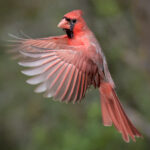
- 9.1 – Northern Cardinal in Flight BY: Ron Bautsch

-
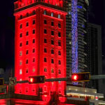
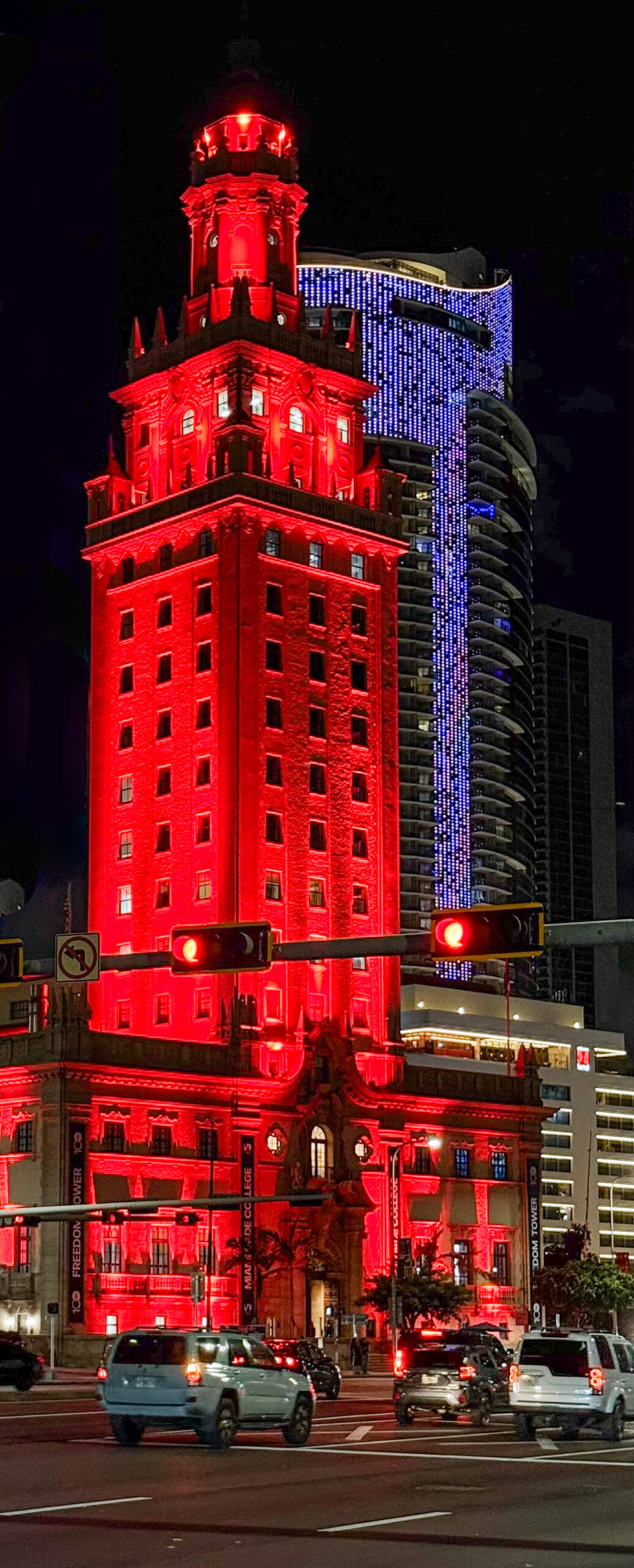
- 9.0 – Miami Red BY: Kitz Parker
-
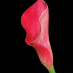
- 8.8 – Fiore Rosso BY: Frank Barnhart

-
- 8.6 – Reflections in Red BY: Michael Patterson

-
- 8.2 – Red Staircase down 3 stories BY: Linda Wagner

-
- 8.2 – epurposed BY: Jerry Schlesinger

-
- 7.8 – Light Play BY: Randy Taylor

-
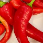
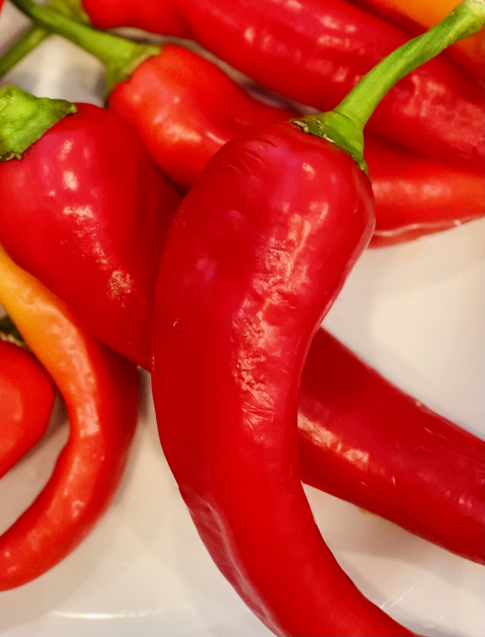
- 7.4 – RedHotChiliPepper BY: Carol Culkin
-
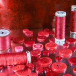
- 7.4 – Ridiculously Red BY: Nick Alvarado

-
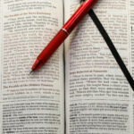
- 7.2 – Red Pen Red Words BY: Steve Simpson

-
- 7.1 – Red Radiance BY: Betty Alvarado

-
- 6.9 – Blooms in Cork BY: Ron Ice

JUDGES Comments:
| Title |
Score |
Comments |
| Northern Cardinal in Flight |
9.1 |
A perfectly timed shot of this bird in flight. The bird is sharp in the eyes and beak with just enough motion blur in the wings to give the viewer a sense of movement. The background is nicely blurred with just enough texture to provide some environmental context. I would have liked to have had a bit more room on the left edge of the frame as the bird does feel a bit crowded. This could be remedied with content-aware or generative fill type tools, but perhaps the maker prefers a more true-life nature image. |
| Miami Red |
9.0 |
The narrow vertical crop was a good choice, focusing the viewer’s attention on the red-lit building. The maker chose a good angle from which to take this image as it places it up against the blue-lit building in the background. The dark sky, the white building in the lower right, and the foreground traffic all combine to create an effective composition. The cars are a bit distracting but overall don’t detract from an excellent image. It would be interesting to see what the newer AI removal tools could do with the cars and traffic lights, but that would be at the maker’s discretion. |
| Fiore Rosso |
8.8 |
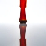
Lovely portrait of a red calla lily. The flower is sharp throughout. Maker chose a good angle to pose the flower and the black background offers excellent contrast, giving dimension to the image. Colors are subtle and don’t compete with the shape and texture. |
| Reflections in Red |
8.6 |
The quiet simplicity and muted tones are what makes this image special. The center composition is very appropriate, though I do wish there’d been a bit more space at the top and bottom of the frame. The image is sharp throughout with a soft background that doesn’t compete with the main subject. |
| Red Staircase down 3 stories |
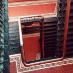
8.2 |
The maker did well to find this composition of an interesting subject. The overall effect is reminiscent of M.C. Escher. The blacks and reds contrast nicely and I like how the railings act as a framing device. The angle of the shot adds a few interesting details. The maker might consider darkening the stairs and railing on the left side to more closely match the rest of the image but otherwise I found this image enjoyable. |
| Repurposed |
8.2 |
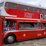
An entertaining image of two London icons: a double-decker bus and a red phone box. Both are sharp. Just enough background was included to give the subjects a sense of place without competing for the viewer’s attention. The angle was well chosen, but I do wish the maker had shown a bit more of the front of the bus. All in all, a terrific travel photo. |
| Light Play |
7.8 |
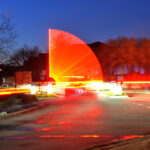
A very creative image using a long exposure of a lit-up swinging gate. The resulting arc is quite compelling. The downside of this technique is the blown out white areas but my eye is still drawn to the arc. Placing it in the center of the composition works well here. The trees on either side create an organic counterpoint to the sharp edges of the arc. The maker might consider cropping up from the bottom a bit to eliminate that triangular shape in the lower right corner. Cropping just above the long reflective area at the bottom would further draw the eye to the main subject. |
| RedHotChiliPepper |
7.4 |
A clever still-life. The maker did a good job of keeping all the peppers sharp and setting them at different angles. The green stems add a bit of color contrast that works well. The beige background is a distraction, however. The maker might consider cropping out the bottom quarter and the right-most quarter to minimize the beige. It would also have the benefit of cropping the two large peppers at a less awkward place. |
| Ridiculously Red |
7.4 |
A creative still life. The buttons and thread are well-placed in the frame and I like the large object in the back as a backdrop. The reflecting surface also works well. The more distant objects are slightly out of focus which doesn’t feel intentional. A smaller aperture or some basic focus stacking would have helped here. |
| Red-Pen-Red-Words |
7.2 |
The red letters in the Bible along with the red pen work well. The pen is at an effective angle in relation to the text and columns. It took me a moment to realize that the black line was a ribbon marker. In my opinion, it would have been better to zoom out a bit, including the page headers in the Bible as well as the top of the pen. It would have also shown how the ribbon is attached to the binding. |
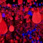
| Red Radiance |
7.1 |
The reds dominate the image with a smattering of blues and purples to add interest. Everything is sharp. Compositionally, the three large elements act as the main subjects in the frame. I do wish the one on the left wasn’t cut off. I don’t know what is to the left of the frame, but I wonder if the maker might have moved the camera over to include all of it. That would have also eliminated the straight box-like element near the right side. I don’t pretend to know what I’m looking at here, but congratulations to the maker for finding this subject and making an interesting image of it. |
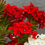
| Blooms in Cork |
6.9 |
The reds draw my attention right away. The composition is good, with three clusters of flowers positioned nicely in the frame. The greens and whites combine with the soft gray background to make an effective frame for the flowers. I do find the reds and whites to be a bit on the “hot” side. A small amount of desaturation might be an effective way to bring out more detail. The image does suffer from a great deal of noise which has the effect of making flowers seem soft. |