2024 April Entries
Topic: Black and White
Judge: Kurtis Sutley
(Double Click on any image below to start slide show)
BASIC LEVEL WINNERS
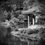
- 1st – 9.0 – Just a beautiful image that lends itself to a black and white format without losing impact. (Although I’m betting the color version of this image is stunning too.) I think the contrast is spot on. I am impressed with the composition and how the water carries me into the image. Images shot in the mid-day sun often lend themselves to black and white conversion because the harsher light naturally creates more contrast. I am curious if generative fill in Photoshop could take the bush from the tip of land in front of the pagoda. (A tricky proposal considering the reflection. (Which could be cropped away). Very well-done image.
- 2nd – 8.5 – 1st – Just a beautiful image that lends itself to a black and white format without losing impact. (Although I’m betting the color version of this image is stunning too.) I think the contrast is spot on. I am impressed with the composition and how the water carries me into the image. Images shot in the mid-day sun often lend themselves to black and white conversion because the harsher light naturally creates more contrast. I am curious if generative fill in Photoshop could take the bush from the tip of land in front of the pagoda. (A tricky proposal considering the reflection. (Which could be cropped away). Very well-done image.
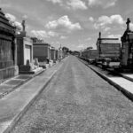
- 3rd – 8.0 – A very clever title with the double entendre. The focus and exposure is basically spot on with one exception you might throw into your clue bag the next time you shoot a similar subject. The sky would contribute so much more to the visual impact of the image if it were dark and foreboding. This can be done in post, or by using a red filter. I find the image is over weighted on the left because you chose to not shoot from the center of the street. To me black and white is really about contrast and light. An evening shot of this subject would naturally add more contrast and shadows creating and even more dramatic presentation.
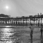
- HM – 7.5 – This is a nice memory of a fun day at the beach. I think the image is well composed and balanced visually. For me the image is either over exposed (not a silhouette) or under exposed without any detail in the shadows. I like the addition of people in what would otherwise be a seascape image. The story is well told. I think the next time you have a similar opportunity; you might wait for both fishermen to be facing out to sea. The far fisherman’s features are lost in the shadow. As a side note not effecting your score, you might try boosting the sky contrast and take advantage of the banding to add a sense of surrealism to the whole image.
- 7.0 – A very relaxing view of an iconic foot bridge. I like how the water guided my eyes into and through the image. I find the focus is sharp with what looks like an appropriate depth of field. To me the image needs more contrast. I find it a bit dull in the mid-tones that dominate the range of blacks. The bush on the right slope of the bridge is very distracting. It would be an excellent candidate for a “generative fill” process in Photoshop or possibly a “content aware fill” in Lightroom. The image has a ton of possibilities.
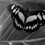
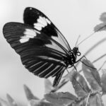
- 6.5 The butterfly in this image is in focus and there is sufficient detail in the shadows to add interest. The background lines of the plant help guide my eyes up to the primary subject. For me there are a few issues with the composition. Both the right wing and the antennae are clipped off. They may not be critical for the butterfly, but they are vital for the image. This image is a case study for when centering the subject won’t hurt as much as clipping off parts unnecessarily. I might also add that most people expect butterflies to be colorful. Because of this expectation, they are not very good subjects for monochrome or black and white interpretations. To me the bright white spots and the black anomaly in the lower right corner are very distracting.
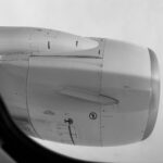
- 6.0 – I think this is a well exposed and properly focused image of a jet engine. The shadows in the window seal have some detail although they are outside the depth of field of the image. To me this image and its story would benefit from some kind of view of the ground to add some context.
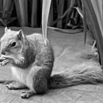
- 5.5 – Who doesn’t like these cute tree rats? That’s what they’re called in the U.K. I like how this image is balanced with a broad range of the monochrome spectrum. To me the plants do a nice job of providing a natural frame of the subject. Unfortunately, the subject focus is soft. When I’m looking at the squirrel, my eyes are drawn to the leaf in the middle. I’m going to go out on a limb (pun intended) and guess this was shot on a cell phone and then heavily cropped. The triangle in the lower right and the very bright leaf in the upper left do not help with the story and could be removed. A target of opportunity that just got away.
ADVANCED LEVEL WINNERS
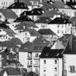
- 1st – 9.5 – I think what we have here is an excellent example of fine art photography in black and white. It looks to me that you nailed the contrast with just the right amount of white without blowing them out. The blacks are varied and accurately reflect the different shades of red that dominate the roofs in Europe. I love the varying textures that are facilitated by a tack sharp focus. I do believe this image could be strengthened by cropping off the lower three incomplete roofs at the bottom of the image without taking anything from the overall composition. I think this image has more than enough of the design elements to warrant a “Very well done”.
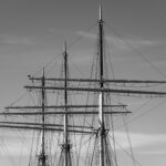
- 2nd – 9.0 – I think this image is a strong beginning for a fine art photo. I like the contrasting vertical and horizontal lines accented by the diagonals of rigging lines . For me the sky could be more interesting with maybe a curves adjustment or use of the contrast slider in Lightroom or Photoshop. I think you did well to keep the crow’s nests to complement the other diagonal lines. The bird makes this image work. Sometimes little things mean a lot. Cudos for the non- traditional aspect ratio. Note: All too often I see empty wasted space with unnecessary distractions because the maker is trying to adhere to some arbitrary aspect ratio. Well done.
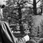
- 3rd – 8.5 – I think this is an interesting image of a sculpture. I find the composition well planned and executed. I like the wide range of black and white and the contrast is very nice. I think the background could have been less dominant with a shallower depth of field because, since this is supposed to be an artist painting what he’s looking at, I am tempted, because of the focus, to try to compare the two. With more blurring, that temptation would be removed, and I would be drawn more to the subject. I think the image would benefit with the painting brightened enough to match the “artist” and balance the whole image. Also, the white thing sticking out of his arm could be removed to eliminate that minor distraction.
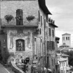
- HM – 8.5 – A very nice city scape with nice contrast and sharpness throughout. I think the balance enhances this image with the road providing a nice contrast of texture. For me, the people add scale. I do think the sky could be enhanced to add more interest. The diagonal roof lines accent the verticals nicely. To my eyes, the whole image is tilted slightly to the left and for me, that’s a distraction. Note: Any vertical lines near the vertical edges of an image will give away the “tilting” impression.
- 8.0 – If you’re going to do a butterfly in black and white, in my opinion this is how to do it. The contrasting dark blacks and bright whites of the butterfly helped it leap from the image and immediately grabbed my attention. To me the less than spectacular foliage is an appropriate contrast for the butterfly. I like the opposing diagonals of the foliage and lines of the butterfly’s wings that, to me, add interest. I think the depth of field, which leaves just a hint of blur to the farthest wingtip, is just what this image needed. I do believe a very subtle vignette would have been the coup de gras.
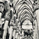
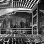
- 8.0 – I see an iconic presentation of a cathedral ceiling. For me, I like the offset composition and the less than vertical lines. To me they convey depth and the perspective of a very high ceiling and deep sanctuary. To my eye, the whites are a bit too white. The interior of these grand cathedrals tend to be a little dark and in an effort to brighten them and add contrast, it’s very easy to over expose either in camera or in post. Getting everything into the depth of field often requires an unhelpful high f/stop although, based on the amount of “lean” in the verticals, I would speculate you used a “wide angle” lens with a relatively low f/stop. In any case, I think the focus and composition are out of the box and add to a nice image. If you’re so inclined, you might try adding a vignette using a radial gradient mask in Lightroom, centered on the back wall that would help guide the viewer’s eyes and subdue some of the brightness of the side walls and near ceiling.
- 8.0 – I see an iconic presentation of a cathedral ceiling. For me, I like the offset composition and the less than vertical lines. To me they convey depth and the perspective of a very high ceiling and deep sanctuary. To my eye, the whites are a bit too white. The interior of these grand cathedrals tend to be a little dark and in an effort to brighten them and add contrast, it’s very easy to over expose either in camera or in post. Getting everything into the depth of field often requires an unhelpful high f/stop although, based on the amount of “lean” in the verticals, I would speculate you used a “wide angle” lens with a relatively low f/stop. In any case, I think the focus and composition are out of the box and add to a nice image. If you’re so inclined, you might try adding a vignette using a radial gradient mask in Lightroom, centered on the back wall that would help guide the viewer’s eyes and subdue some of the brightness of the side walls and near ceiling.
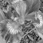
- 7.0 – A very nice composition of an Iris. For me the image needs more contrast. Black and white is about contrast and light because without color, the eyes need edges to follow. Contrast gives your eyes something to follow. I like that you kept all three of the bright petals of the flower. They help to keep my eyes centered on the flower. I do think a shallower depth of field would keep me interested in the whole flower and remove the distraction of the ground mulch. The leading lines of the petals help some to draw my eyes to the flower but not enough to overcome the dominate middle grey tones.
MASTER LEVEL WINNERS
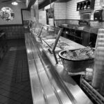
- 1st – 9.5 – The title says it all. I really like the feast presented. Maybe there is too much for one meal but I like left-overs when they are done this well. I applaud the nerve to submit such a visually busy image. To me this image has all the design elements and principles except color. If I were to make one recommendation, it would be to brighten the central “skyline” reflection to draw your viewer’s eyes into the image. I would like to see this image printed on white metallic paper. Stunning.
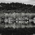
- 2nd – 9.0 – I like just about everything about this image. The contrast is just right. The focus is tack sharp. I like the layers of light and dark created by the reflection. For me, the image would work better with a crop up from the bottom to the same height as the sky at the mountain peak. That would deal with the single reflection of the hillside house and the light triangular sky reflection in the lower right, both of which keep drawing my eyes away from an otherwise beautiful image. I think your shadows hold just enough detail and your whites keep my attention. Well done.
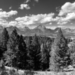
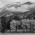
- 3rd – 9.0 – This is a wonderful choice for a black and white rendering of a landscape. To me the multiple layers makes for an interesting and captivating image. I like how the straight lines, both vertical and horizontal, of the Aspen trees compliment the diagonals of the mountain sides. For me, the clouds are like the cherry on top. I would like to see the Aspens a bit brighter as well as the lower cloud layers to add more contrast and better-defined layers. For me, clouds should be white and not grey. I also think a more contrasting and moody sky would add that much more drama. A nice capture with a ton of possibilities.
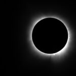
- HM – 9.0 – A beautiful capture of the eclipse with the bonus of the solar flares. I think this is an iconic image that serves to properly present the visual impact of this rare event. The image appears to be sharp and the exposure brings out the corona nicely. I like that you didn’t center the subject .The secret to a good eclipse image is in the focus. You found the focus. Very nice.
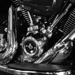
- HM – 9.0 – Back and white is all about light and contrast and this image has that in spades. To me the textures and lines make it a fine art image. I like the composition. I think the image is hurt just a little by the out-of-focus laydown bar on the lower right and the small triangle of “grey” in the upper left. I like that the maker resisted the temptation (if there was any) to square up the image. There is nothing square about a Harley. Very nice.
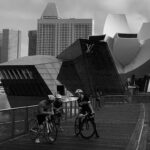
- 8.5 – A very nice contrast of shapes, textures, and lines. I like how the shapes are layered, with the lower third dominated by the human figures, the middle dominated by the intersecting diagonal lines, and the upper third dominated by the vertical and horizontal lines. For me, the bottom third shadows are too dark. I think if you used a brush from the masking tool in Lightroom to lighten the three cyclists, this image would really pop. I would leave the pedestrian in shadow as a kind of easter egg for the viewer to discover. You might even try a linear gradient mask from the bottom to reduce the shadows and boost contrast. The only other knit-pick; I don’t think the image is level based on the edge of the building on the left in the background.
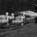
- 8.0 – A very nice candidate for a black and white image. To my eyes the image is properly exposed and tack sharp. The eye of the goose tells the story of a properly focused image. I like how all subjects have an eye visible. I do think the overall impact could be boosted by eliminating most of the water below the reflections. To me, you could use a masking brush in Lightroom or Camera Raw to boost the highlights of the reflections and improve the overall presentation. The lead adult goose really needs some room to the right to move into. The question is just how much to give her(?). A rule of thumb I prefer is to have at least half again as much room as the subject just left. In this case, with the goslings occupying most of the frame, as much as she would need based on traveling as fast as the wake hints. (Yea, that’s really subjective.) Give her enough room to see the wall and avoid it. Otherwise, a very nice black and white wildlife capture.
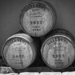
- 8.0 – An interesting study of textures and shapes. Without color, many subjects rely totally on textures, shapes, and contrast to generate interest. To me, this one is a good example of that concept. There are a couple of issues that are holding back this image as a really nice art piece. The first thing my eye looked at was the bright strip of light at the bottom. It really serves no purpose other than to distract. It also gives the illusion that the image is tilted to the left and with the casks not perfectly level, that creates significant tension for the viewer. I think that using a masking brush to lighten the face of the casks, adding contrast that would help draw and keep the viewer’s attention to the center of the image.
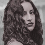
- 8.0 – What a cutey. Nicely composed. Nicely exposed. Nicely lit. Sometimes (just sometimes) children can be the most honest subject to capture. The subject is not just the face, but those eyes. I like the catch-lite in the eyes. There is just enough facial shadow to keep my attention to the face. Just a couple of suggestions. Get rid of the small spots under the right eye. Darken the bright area behind the left ear. I think the “iris enhance” preset of the masking brush in Lightroom could do wonders for what are already piercing eyes. You might try balancing the space beside both ears to add symmetry and break everyone’s heart. Don’t know what her modeling fee was, but I think you might double it.
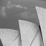
- 8.0 – A fine art edition of an iconic building from down under. The image is tack sharp and properly exposed. To me, the visual impact would be enhanced with a more belligerent sky. The new Lightroom masking tool allows for the selection of the sky that can be manipulated like any normal image. In camera, this darkening of the sky and improved contrast would be made possible with a red filter that I think would make this image pop. I like that you maintained a matching space along the top and left side for balance. A nice choice of subject for a black and white image.
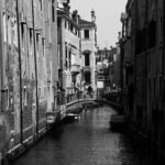
- 8.0 – A visual presentation of the canal environment of many costal cities in Europe. I like how my eyes are drawn into the image by the sunny side of the canal. I like having someone on the bridge to add scale to the buildings. Foe me, the right side shadows are too dark and hide the leading lines on that side of the image.Maybe a linear gradient in Lightroom masking could gradually reduce some of the shadows and add a bit more drama. To my eyes, the focus seems a little soft. There is nice contrast on the sunny side of the canal. To me, a darker sky would help direct my eyes to the center of the image.
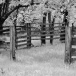
- 7.5 – It’s certain this corral has seen better days. The contrasting vertical and horizontal lines help tell a story if only they could talk. With many of the design elements represented, I think this is a nice representation of what a black and white needs to please my eyes. To me, the textures and detail come from a properly focused image. I like how the tree frames the upper part of the image. I don’t think the bottom of the image containing the dark weed in the lower left contributes to the story and could be eliminated.
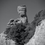
- 7.5 – I like the layers of contrasting black and white created by the central vegetation. To me the image is sharp and properly exposed. I do think the vignette is a bit too strong. I think the overall impact would be enhanced by cropping in from the right to lower the vegetation below the height of the hoodoo. I think that would emphasize the rock formation better. The subject is the hoodoo so anything that distracts from the subject (like the road sign) needs to be delt with in post. I think cropping up from the bottom to eliminate the horizon line would kill two birds with one stone. I like the multiple layers of texture that is complimented by the texture of the vegetation. Maybe a curves adjustment to add just a bit more contrast would really make this hoodoo pop.
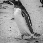
- 7.5 – A nice choice for a black and white wildlife image. Very nice shadows and proper exposure of the white areas. I think contrast is as good as you can make it. I would like to see a little more space for this walking penguin to move into. The dark blotch under its chin is very distracting as is the piece of a fellow penguin in the upper right. I think both could be handled with generative fill of maybe even a content aware brush in Lightroom.
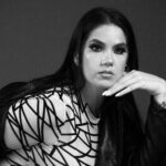
- 7.0 – An interesting portrait. I like the pose and the contrasting textures. Portraits are a genre of photography that brings unique challenges. For me, I think the right arm and everything below the neckline contributes nothing to the beauty of this young lady. I think sometimes less is more. By cropping away the excess, my eye is focused on her face and the symmetry created with her horizontal hand accenting the vertical lines of her face and hair. There is a soft texture to her hand but shinny areas on her forehead, cheeks, and beside her nose. I like the dark moody eyes, but I think reducing the shadows just a little would expose more detail, including those long eyelashes.
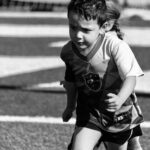
- 6.5 – This is the face of determination. Lots of contrast and nicely focused with a nicely blurred background to highlight the subject. I like how you provided space for him to move into. I have no problem with his legs. If you’re going to cut off an appendage, make it look deliberate. You did. And it did nothing to hurt the story. The problem with this image is the strange growth on the back of his head, as well as the extra leg. Sometimes, no matter how hard we try as photographers, we get caught up in our own emotional ties to an image. Try not to do that. I do think you need to reduce the shadows on the body to bring out a little more detail. Same is true of his eyes so we can see the determination in those eyes as well in his determined body language. I’m guessing he won.
- 1.0 – This is a lovely provocative image well framed and exposed. Unfortunately, this is not a black and white image.
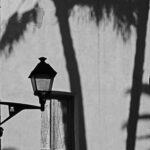
- 1.0 – An interesting choice for a black and white silhouette. The composition does have the subject near a one-third power intersection. For me, there are just too many fuzzy background distractions. The out-of-focus palm trees completely dominate the image. A portion of the right side of the lamp is lost in the central palm tree trunk. Just based on the image “damage”, I think what we have here is a photograph of a photograph that just doesn’t work.
